Unico Pay / Interaction prototype
Choice first.
Payment second.
A hands-on interaction prototype exploring how card choice and installment review can feel simpler without disappearing.
My contribution
Direction through the details.
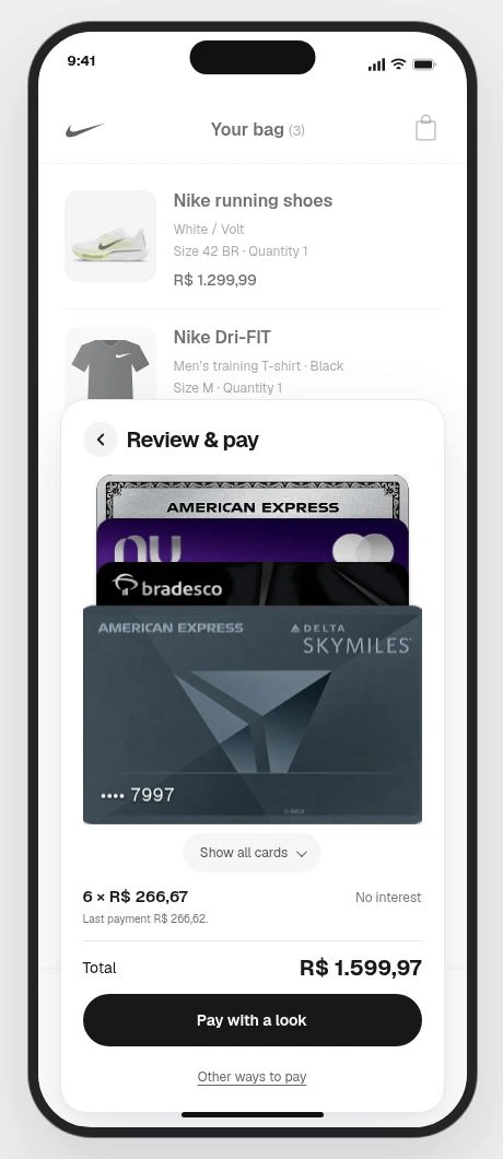
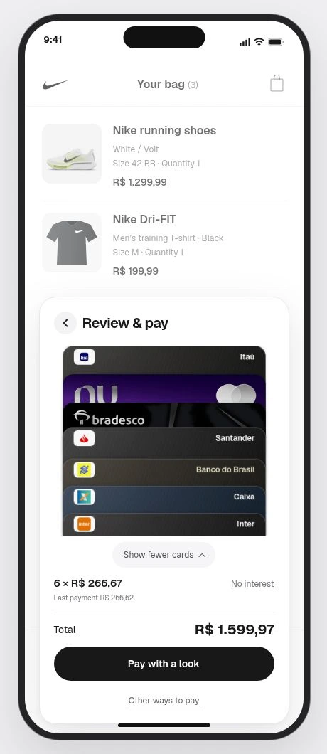
I directed the interaction refinements: swipe to change cards, a larger selected-card state, full-row editing controls, and a compact panel that adapts to Brazil’s installments.
Design prototype. Production results and measured outcomes are not reported.
The challenge
Make the next choice feel obvious.
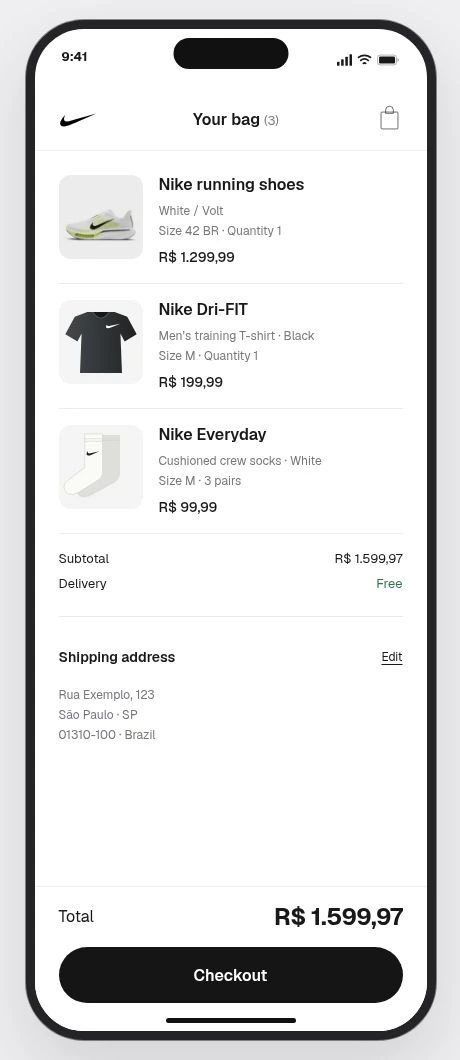
Checkout brings several decisions together: the purchase, the payment card, and how to pay. This prototype explores how those choices can live in one compact experience without losing the shopper’s context.
The interaction decisions
Reduce the noise.
Not the choice.
I directed the removal of redundant payment buttons, repeated branding, and explanatory copy competing with the task. One card stays prominent; alternatives appear on request. Installment terms remain alongside the full total.
Selection / hierarchy / progressive disclosureThe experience
From basket to payment choice.
Real interface captures, not imagined product screens.
What to validate next
Clarity before speed.
Test whether people can identify the selected card, understand the installment terms, and change their mind without losing the purchase context.
Selection
Can a shopper recognize and change the active card?
Payment understanding
Are the full total and installment amounts understood together?
Control & recovery
Earlier iterations explored a five-second payment countdown. Validate whether timing is understandable and interruptible, and whether returning to the basket preserves context. Speed is not a substitute for control.
Proposed validation questions, not measured usability results.
Design prototype with illustrative transaction data and third-party brand assets. These captures do not establish a merchant partnership, production integration, or payment/security performance.
Human Token website
Making identity feel personal before explaining the mechanics.