Human Token / Website design
An expressive
first impression.
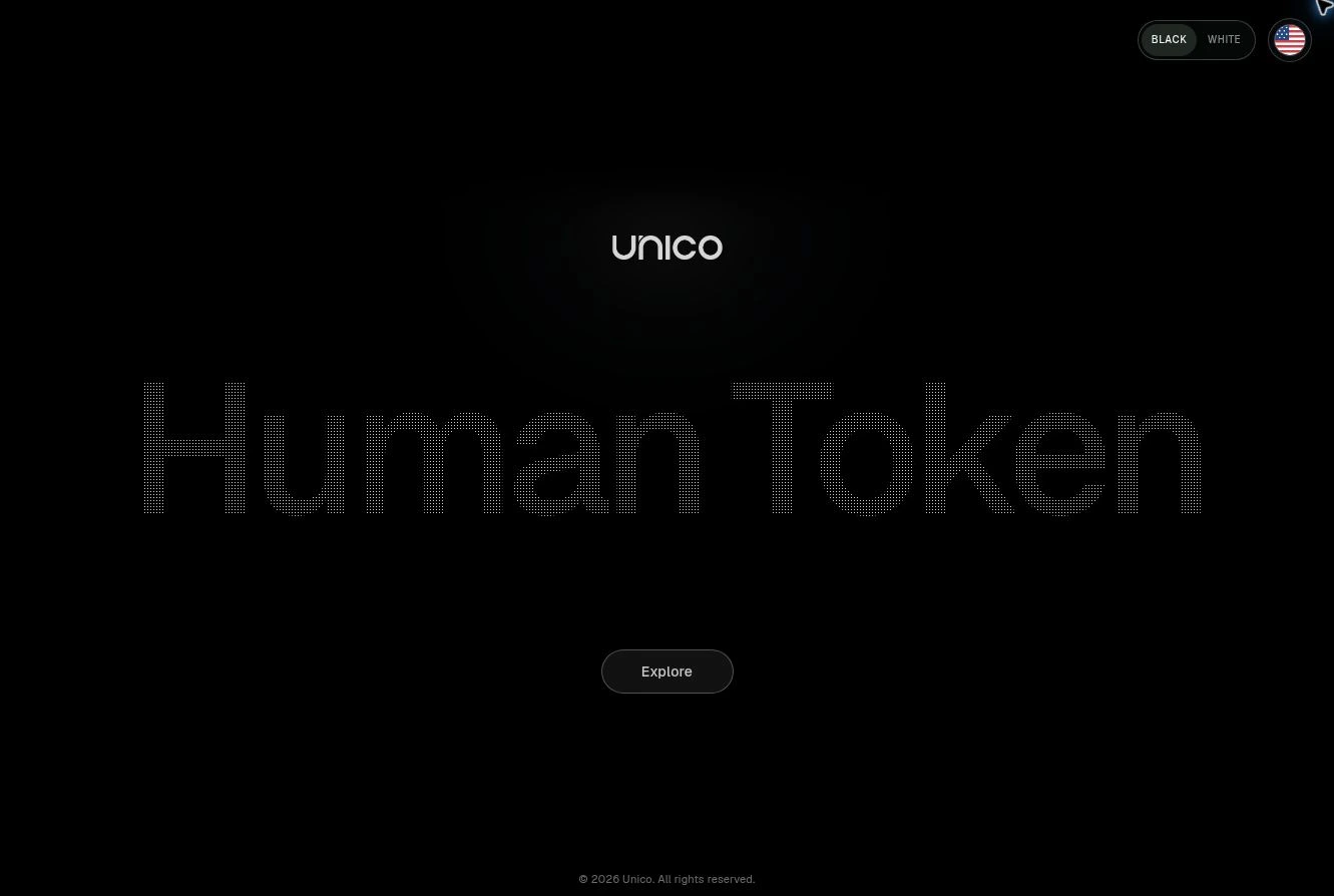
A web prototype exploring how to introduce Human Token with a conceptual opening, then make room for the product story.
My contribution
Separate the opening from the explanation.
I directed a cleaner conceptual opening and moved the mechanics into “How it works.” I kept phone screens out: the UI was unfinished, and API-only tokenization does not require liveness. Showing a capture flow could make that optional experience seem mandatory.
Website direction and iterative design decisions. Design exploration; production outcomes are not reported.
The design question
How much should the first moment explain?
The direction asked for a clean, conceptual opening that makes identity feel personal without turning the first screen into a technical diagram.
The deeper explanation belongs later: how it works, the distinction between the token story and optional liveness, and the integration experience.
The tradeoff
Expression first.
Clarity within reach.
Keep the opening visually focused while leaving the explanatory content easy to reach. Avoid using unfinished phone UI as a shortcut for explaining the product.
This is a website design exploration, not evidence of a launched identity service or measured conversion improvement.
The full website capture comes from the existing v200 source; the live study reuses its portrait geometry. Website statements and illustrations do not establish security guarantees, biometric accuracy, or production integration.
Human Token film
A person creates their token. Then comes back.